I’m Jen, a product designer who works with startups to launch delightful products.
Through user testing, hight level UX design, and beautiful UI, I am able to prototype and deliver products that are intuitive, engaging, and accessible.
I beleive that in order to build the best product, one must have empathy, patience, an open mind, and fully understand the problem before solving it.
I talk with users and leadership to understand the goals that need to be accomplished, then work with product and engineering throughout the entire product development cycle. I believe collaboration is key in building the right thing and building it right.
Omio in the News
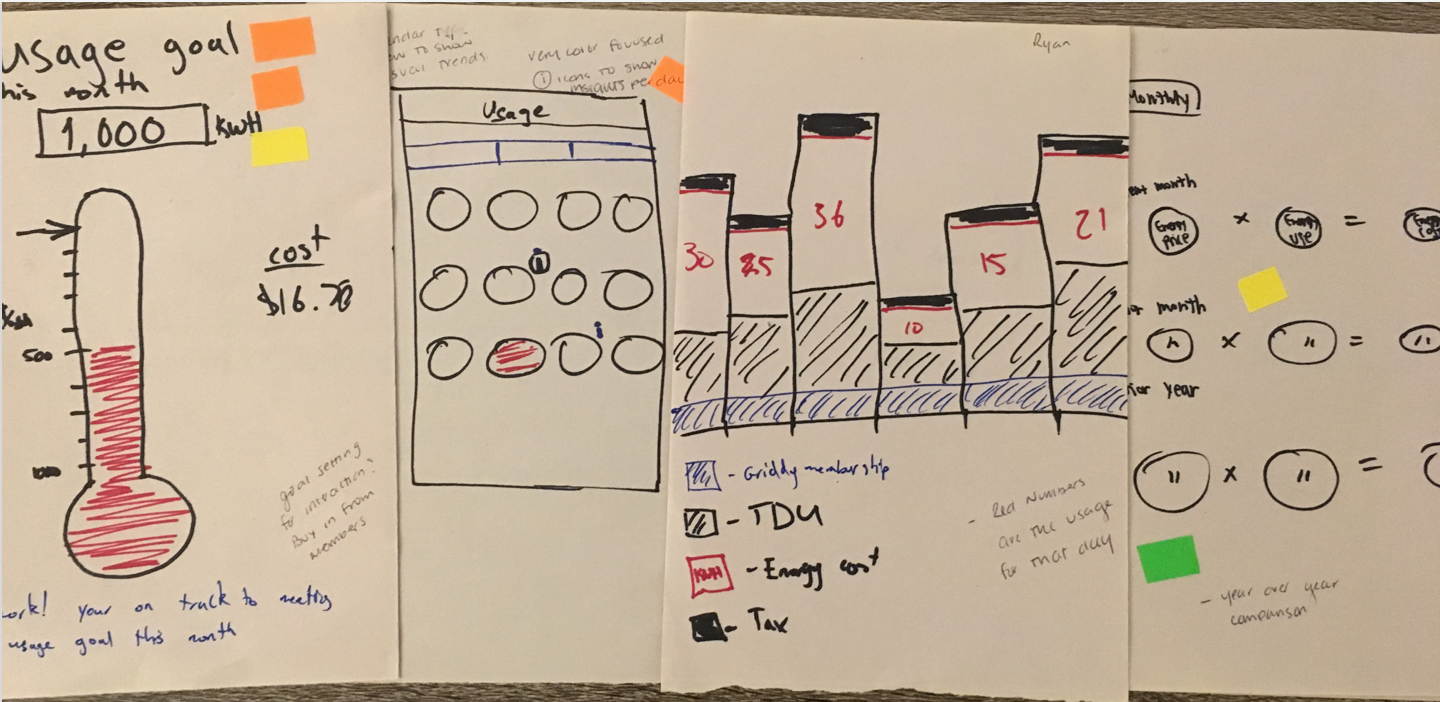
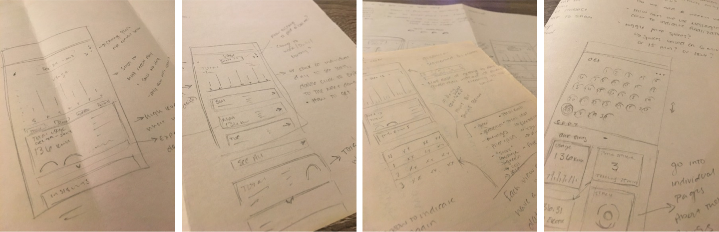
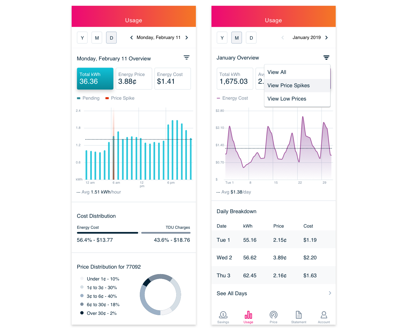
Redesign of the Usage Page Experience
"[With the current page] I compare the pricing to see if I am using more or less energy during peak times. I'm more interested in my consumption patters, and right now I have to do it in my mind." - Rick
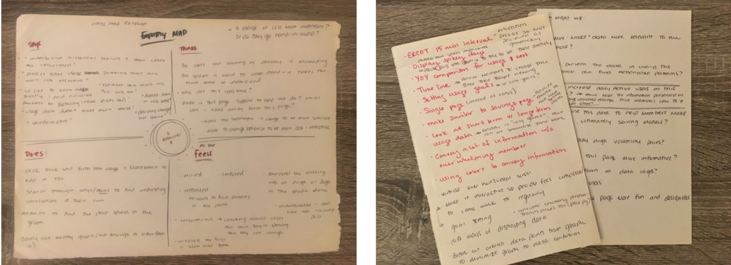
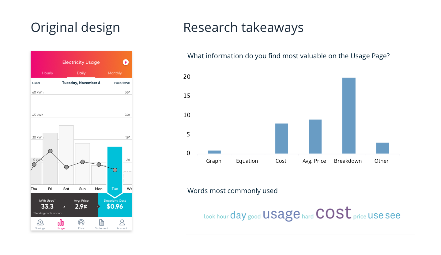 With this information in mind, I synthesized the information and hypothesized on ways we could improve the experience of this page.
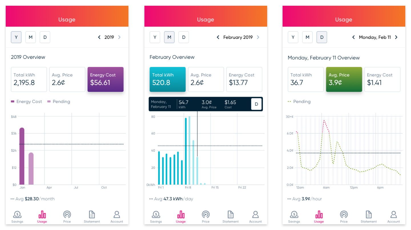
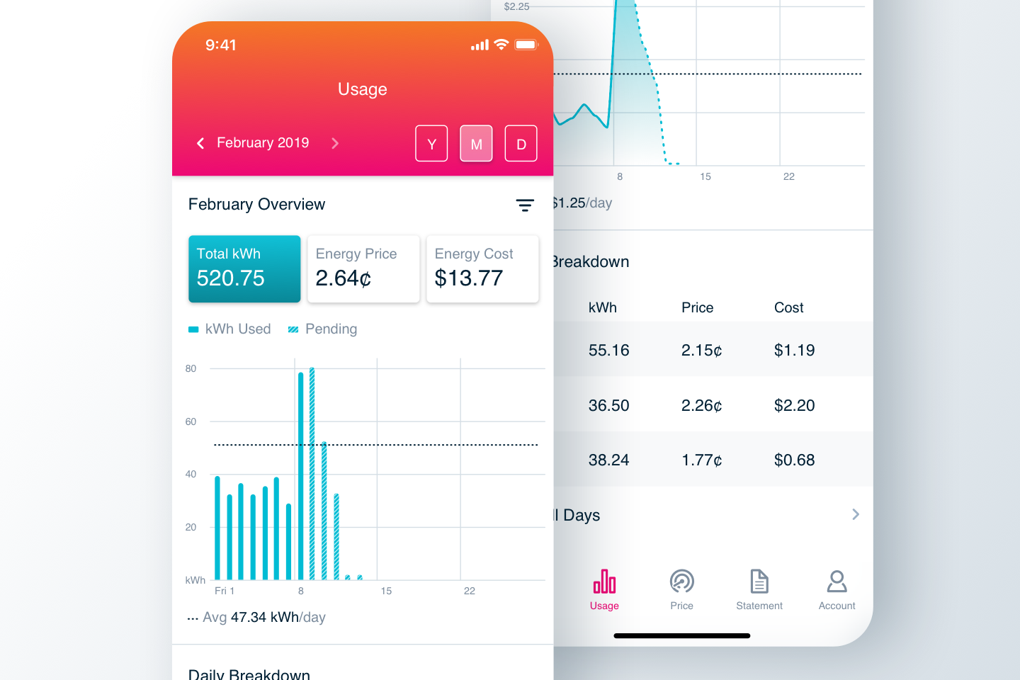
"You don't have to be confused with two values. I've been here since September and I still need to relate the line to the price and bar graph to the kWh. It's much more organized in this presentation." - Ruth
 We found some areas for improvement which we took into the final design such as a more relatable way to drill down into the summary details, more distinct visual differentiation of the Pending and Finalized data, and including background bars in the graph for easier readability.
"It's not only a cost saving thing but it's just using energy smarter. To be able to make wiser decisions. From what you're showing me here, this is good stuff." - Kevin
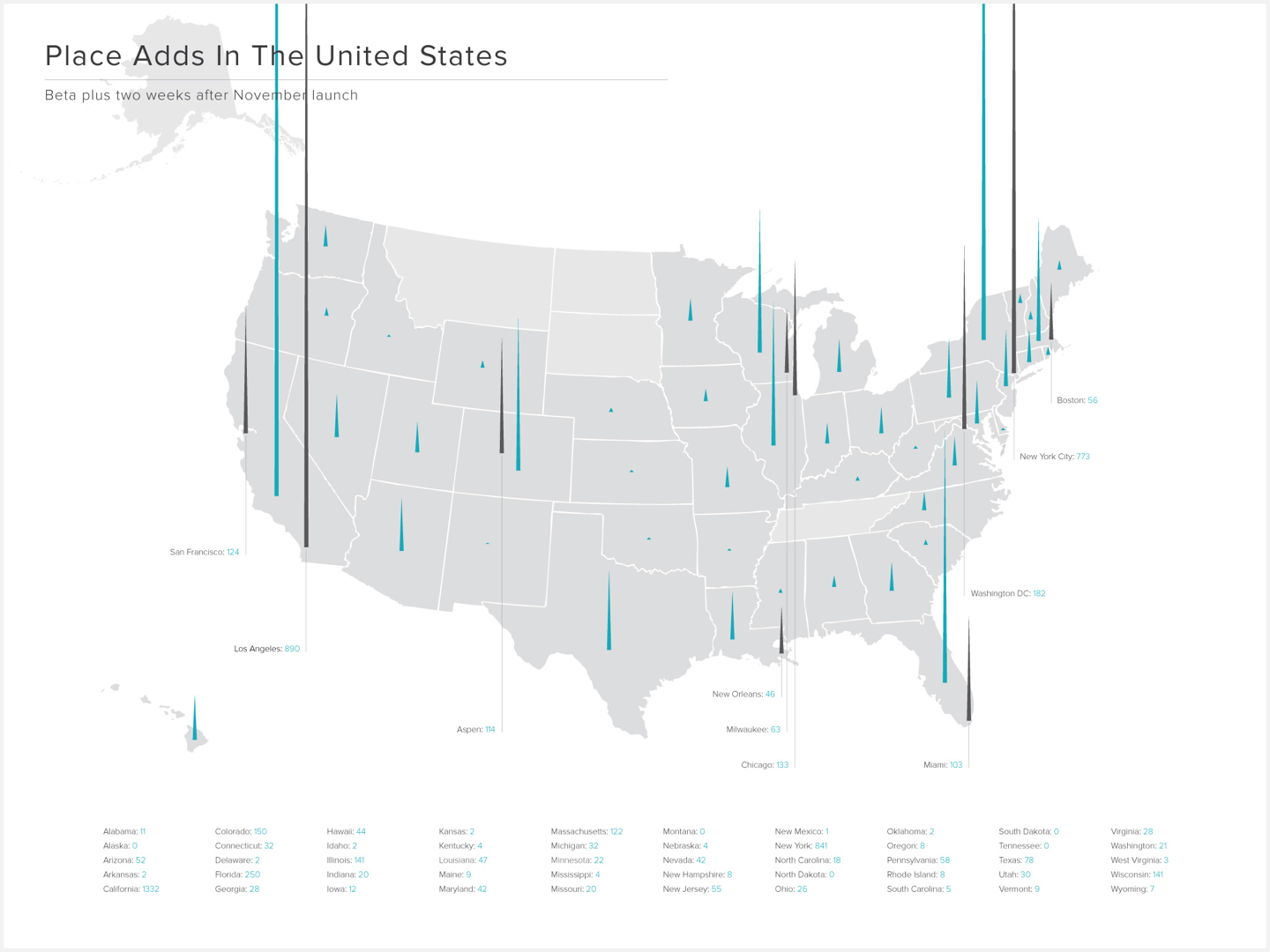
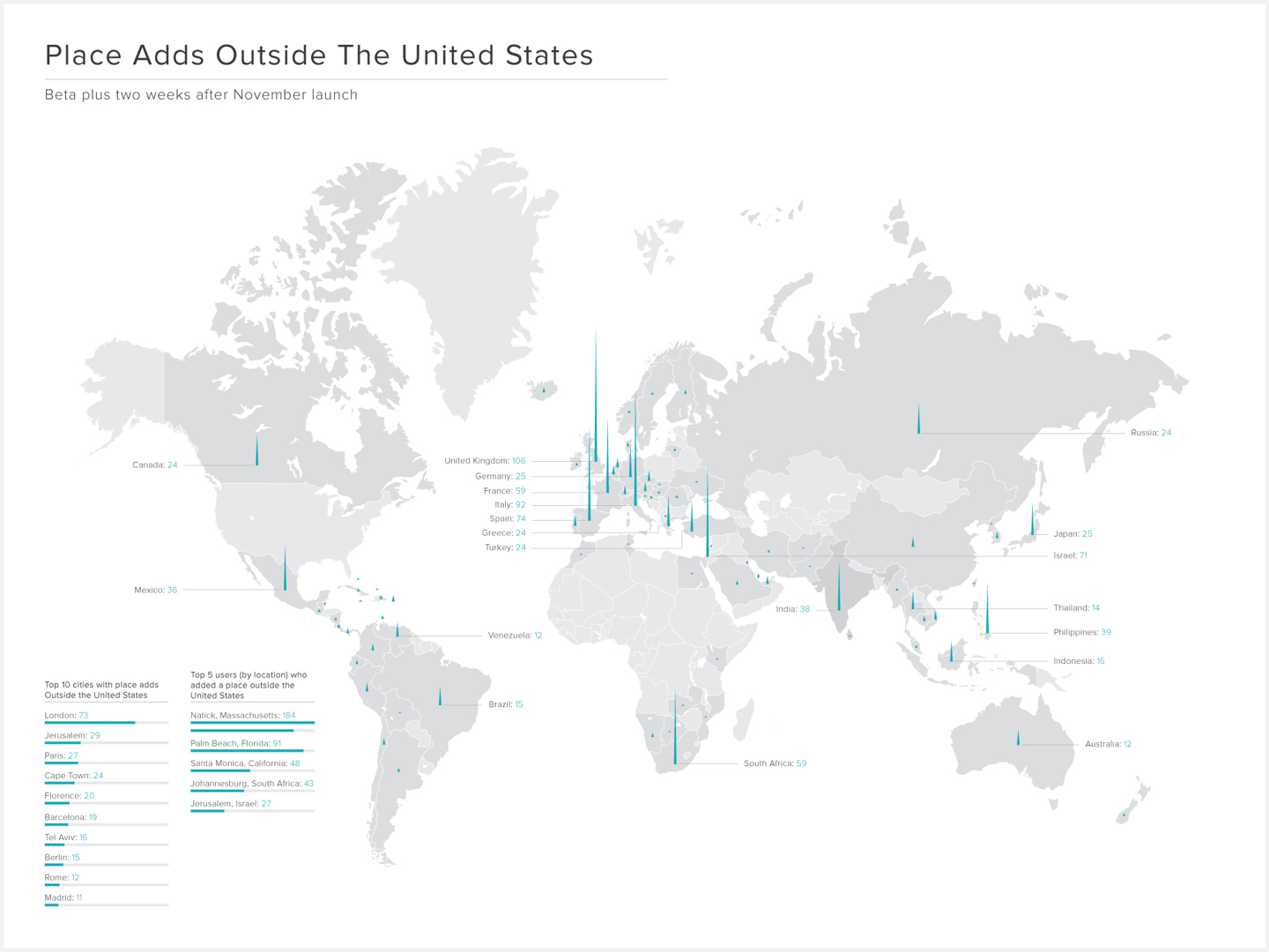
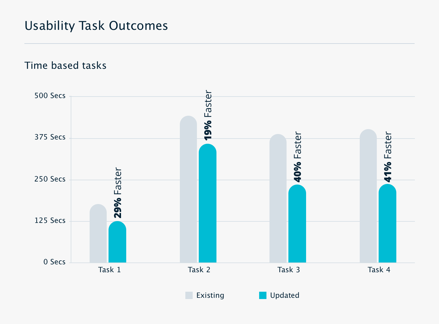
 The initial MVP was tested with a Beta version to ~100 members across all platforms. We used the beta time to continue to improve on the experience, gather member feedback, and fix bugs before releasing to the whole Griddy community.
Product Market Fit Research
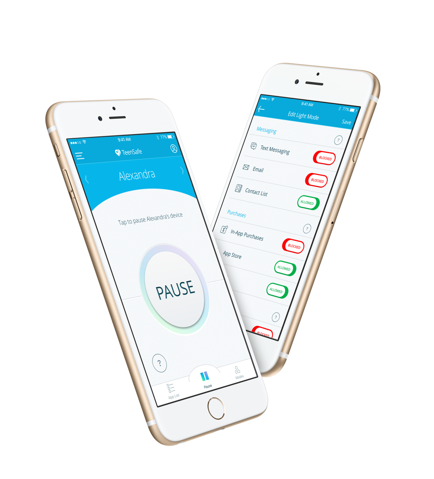
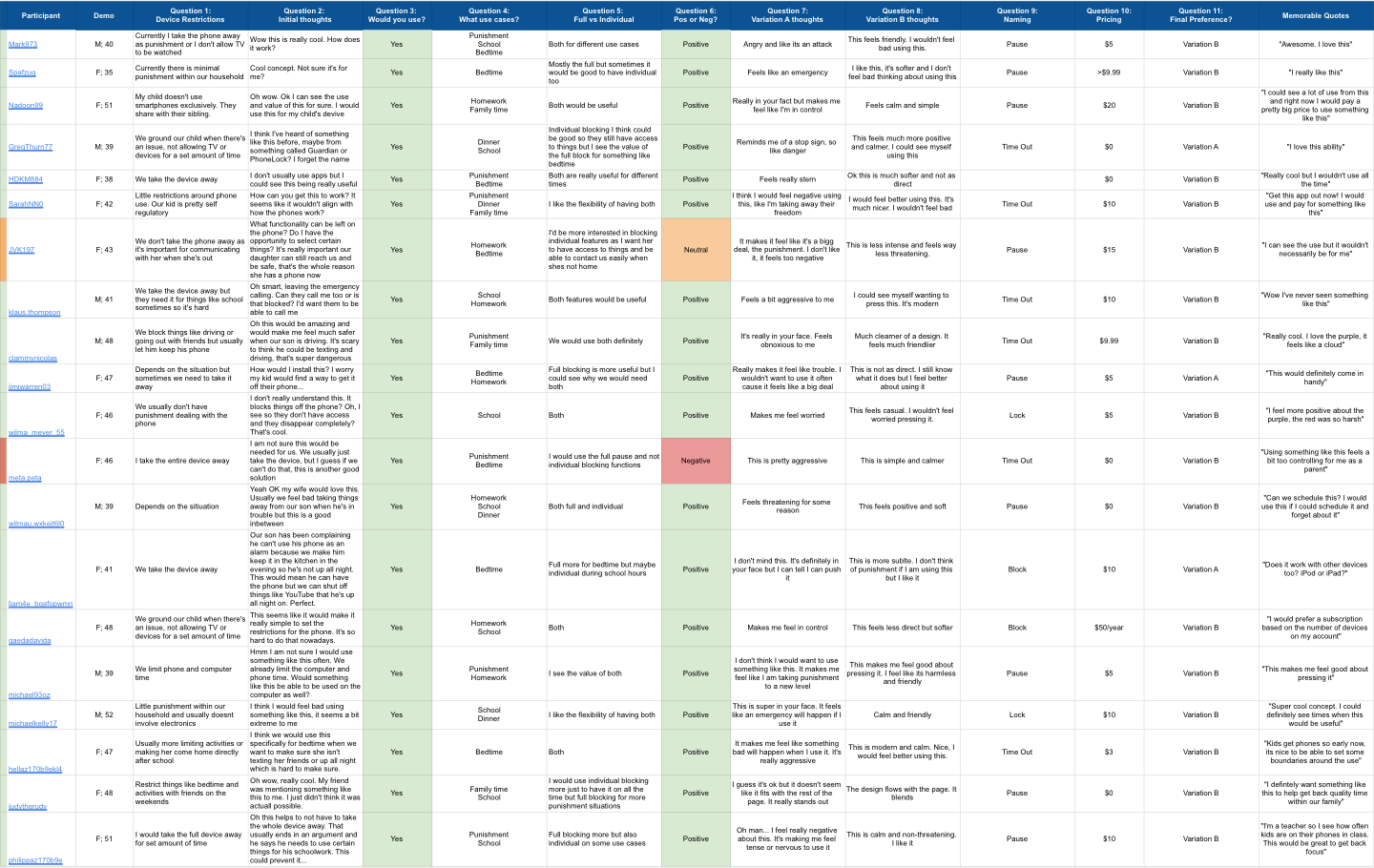 We were thrilled to see the initial reaction from parents as very positive with quotes such as: “Love this ability”; “This would definitely come in handy.”; and “Get this app out now! I would definitely use and pay for something like this.”
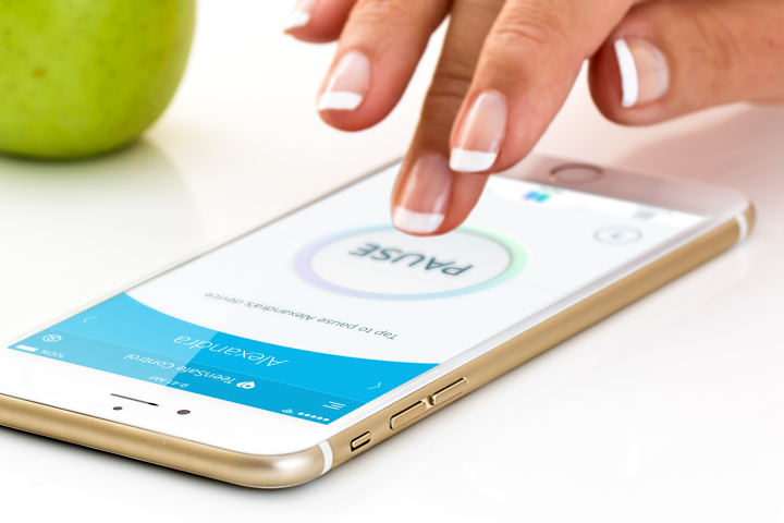
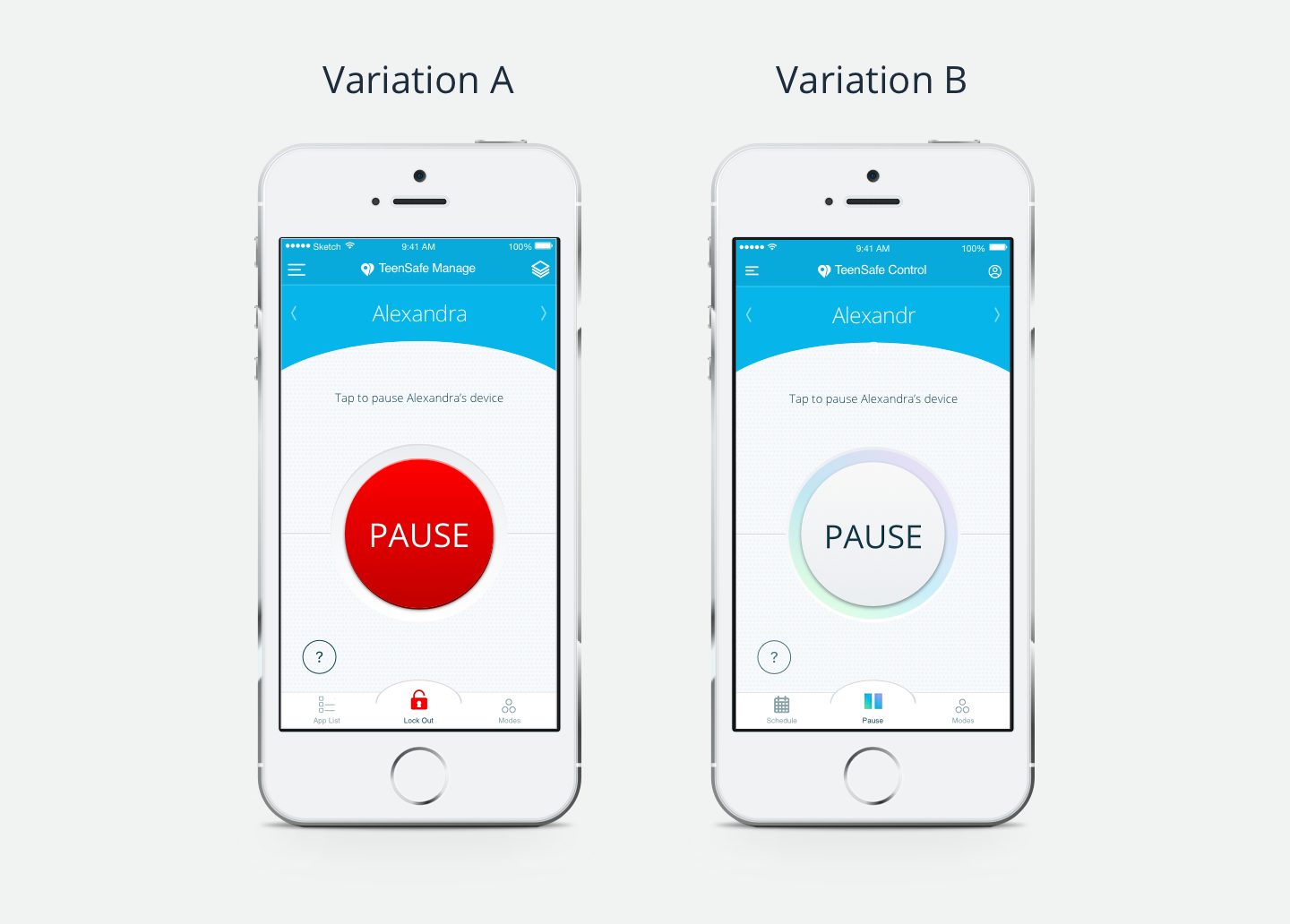 In an even split of parents seeing Version A or Version B first, we asked the parents how they felt regarding the two versions of the Pause button, as well as how they might use a feature like this within their own family. While punishment was one of the main reasons mentioned for using this feature, along with bedtime and school/study time, the result was overwhelmingly one sided, with Version A being seen as “angry”, “a bigger deal”, or like an “emergency”; while Version B was felt to be “non-threatening”, “softer”, and “calmer and more modern.”
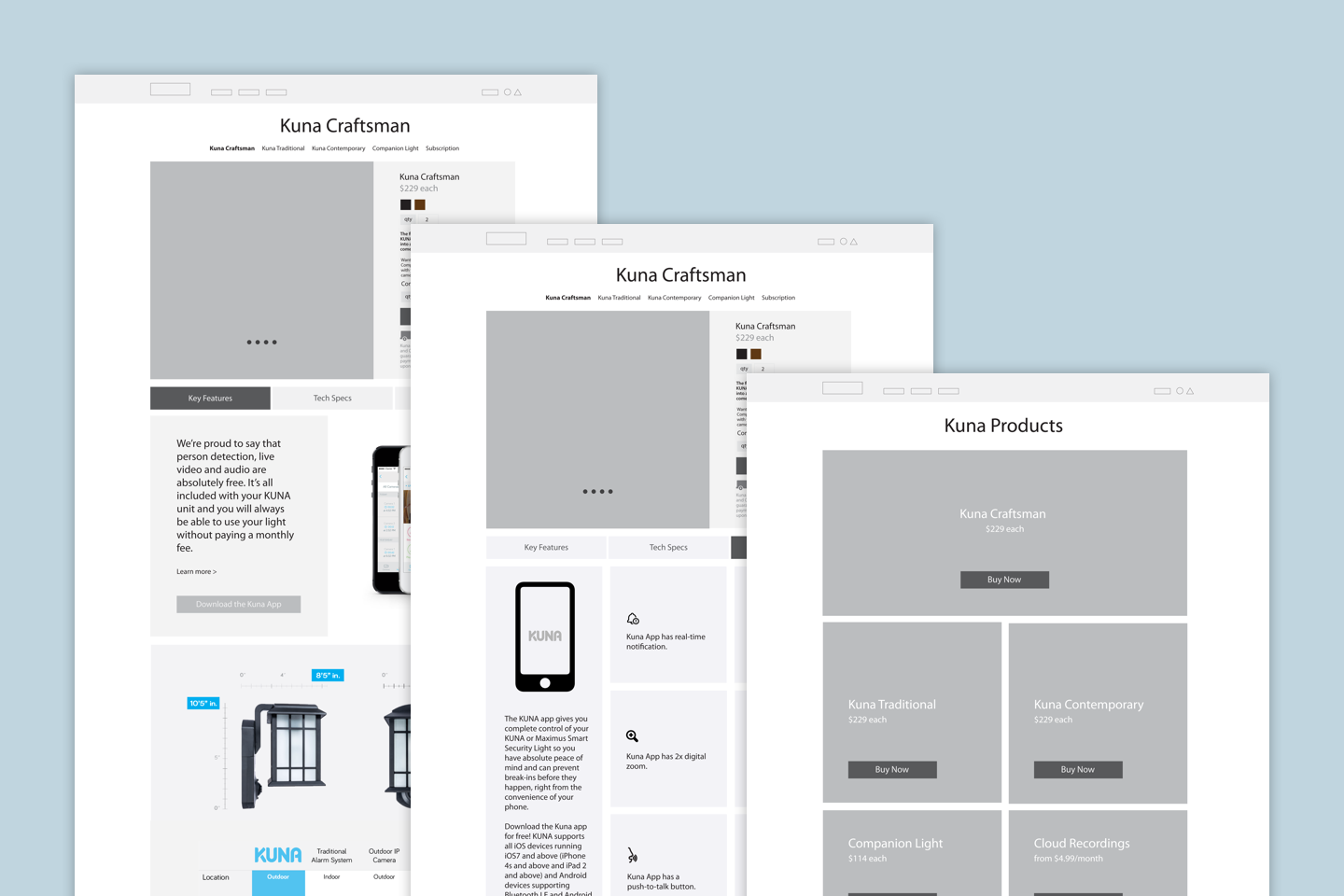
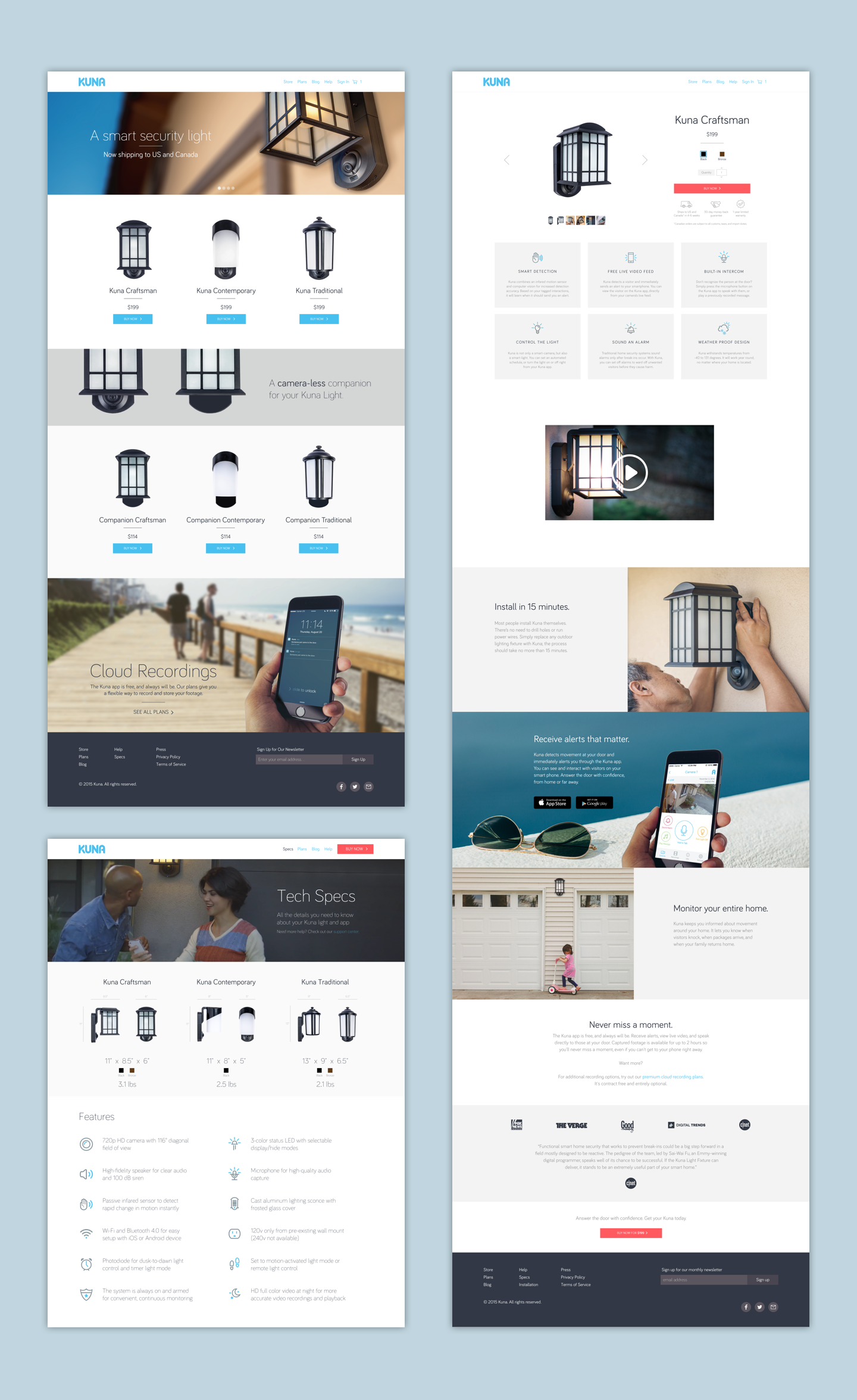
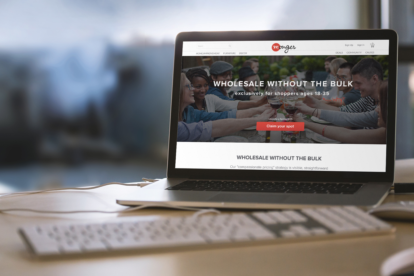
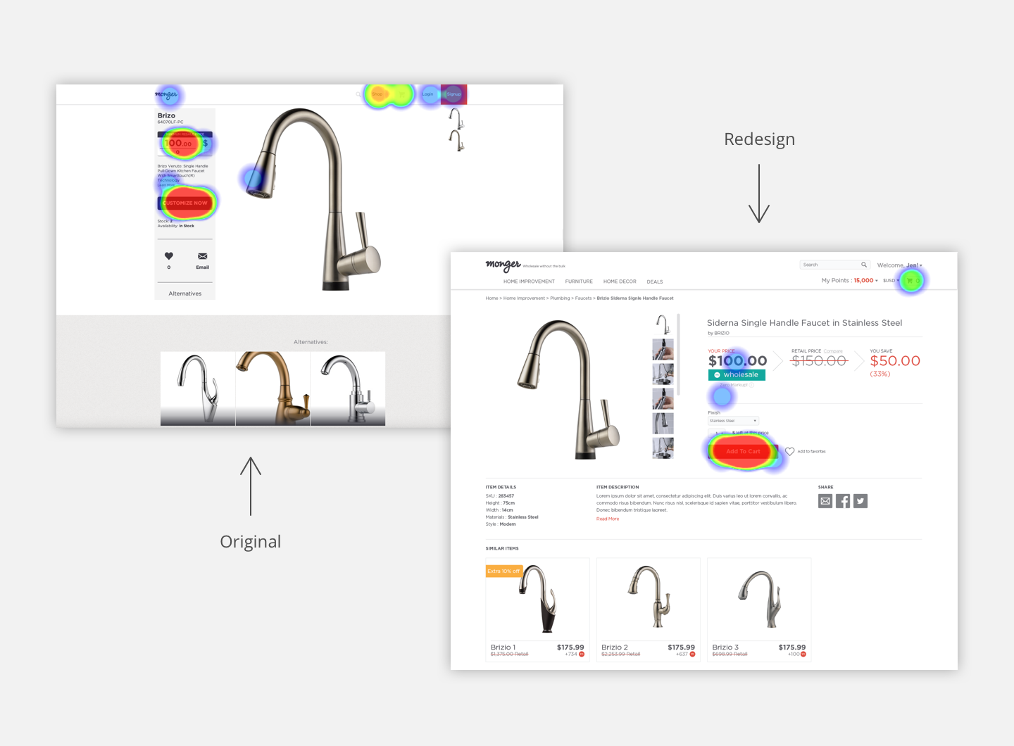
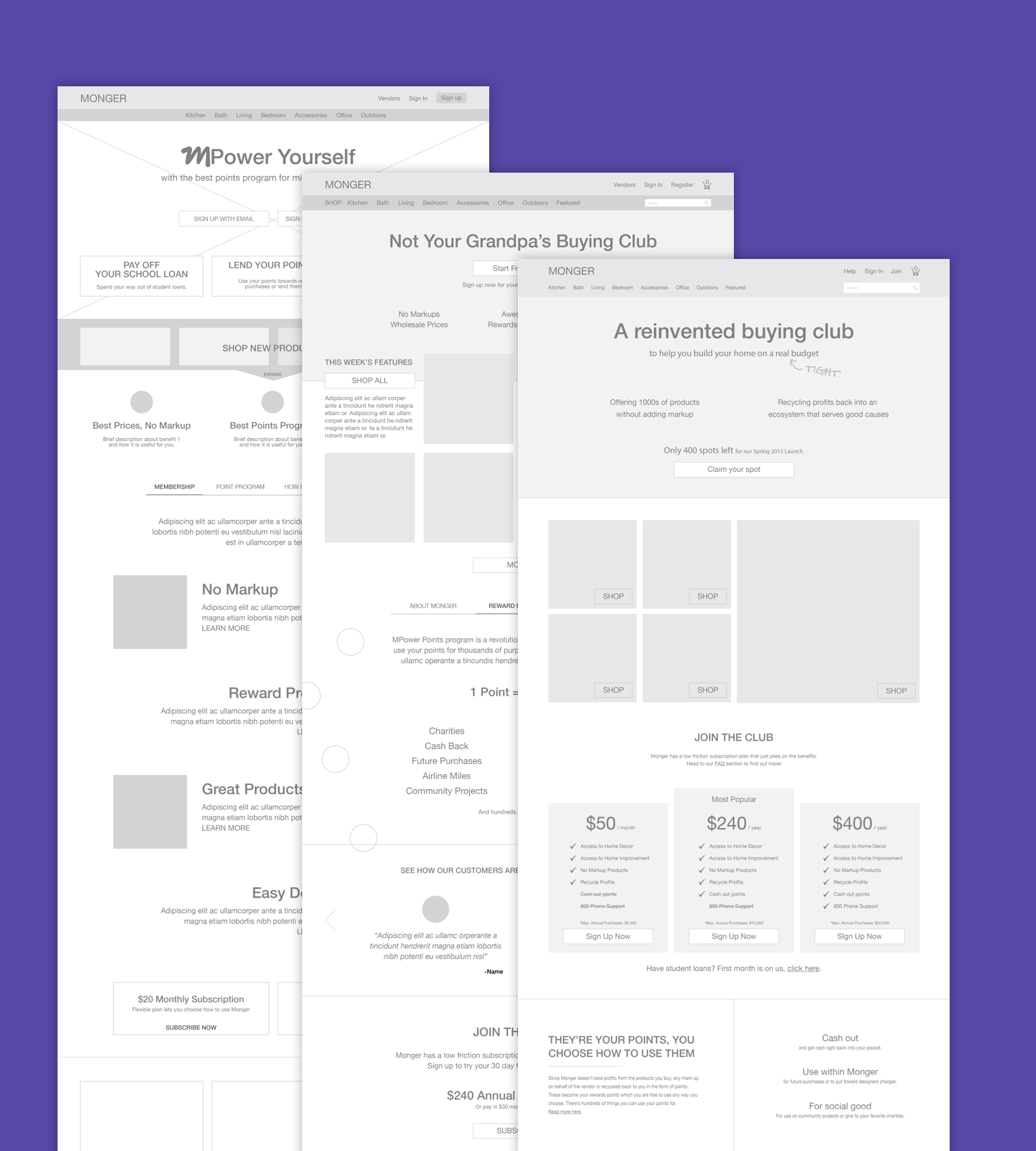
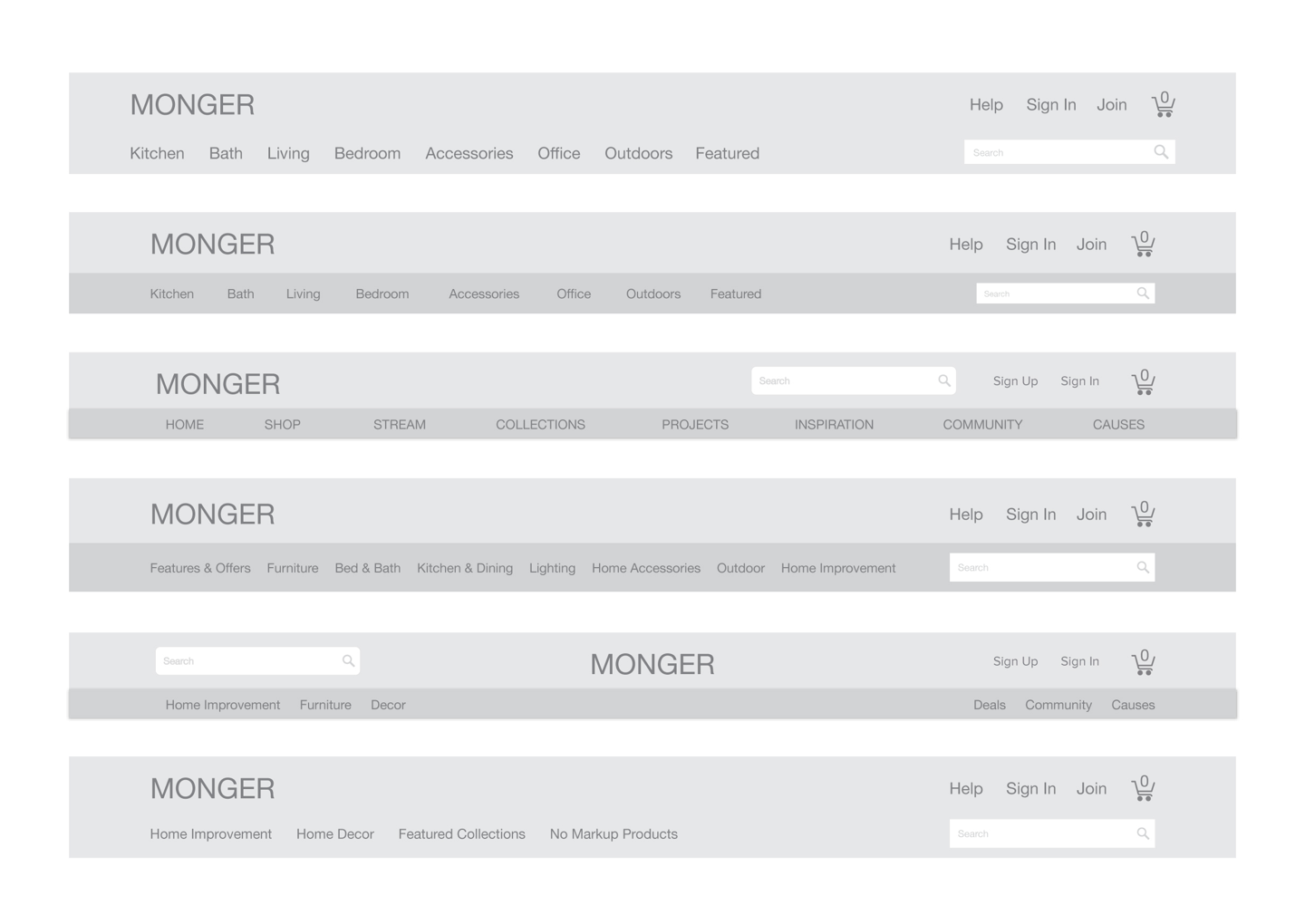
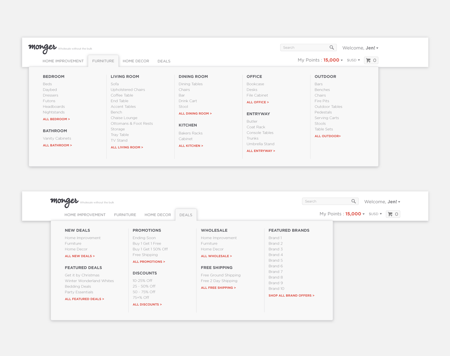
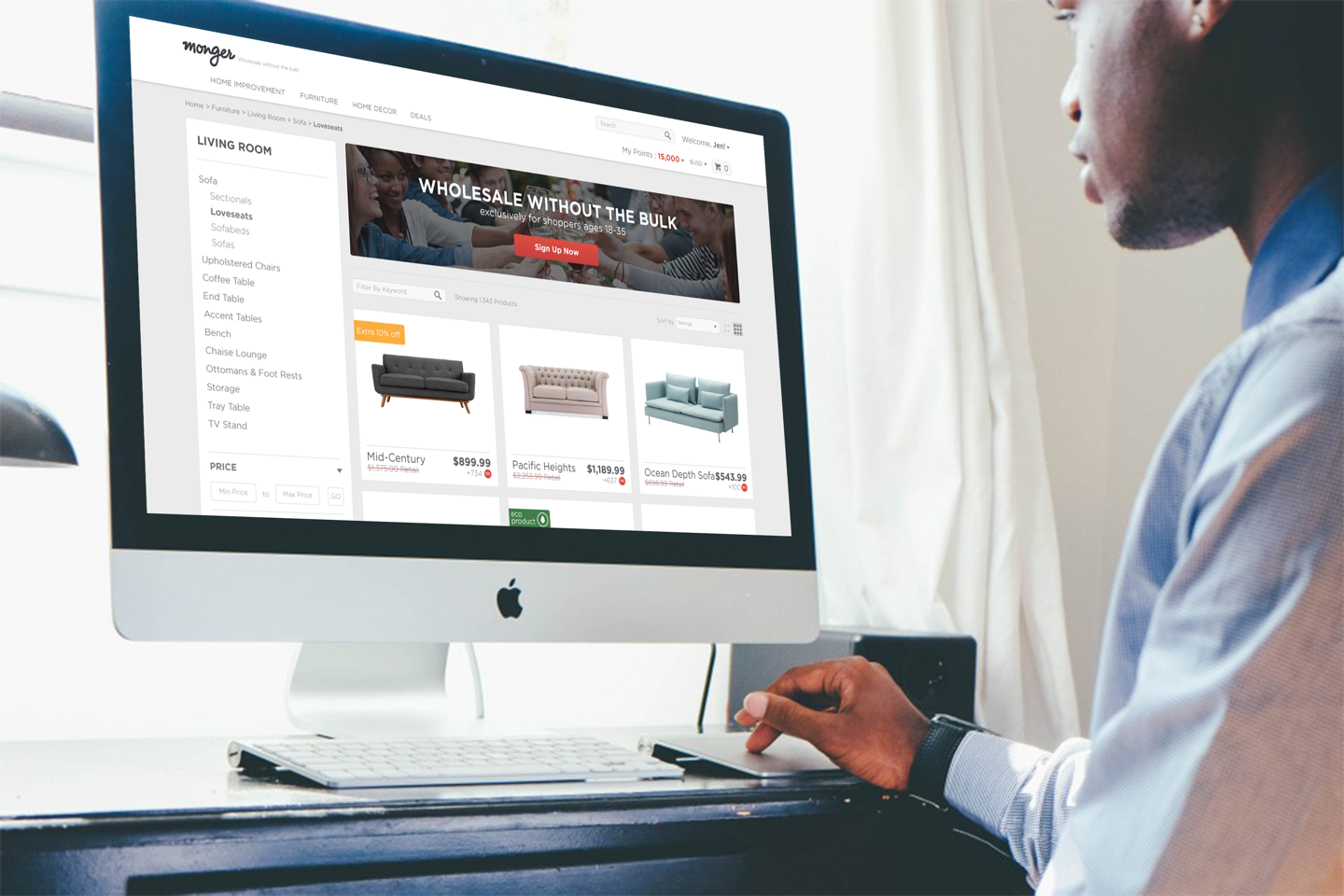
E-commerce Conversion Optimization
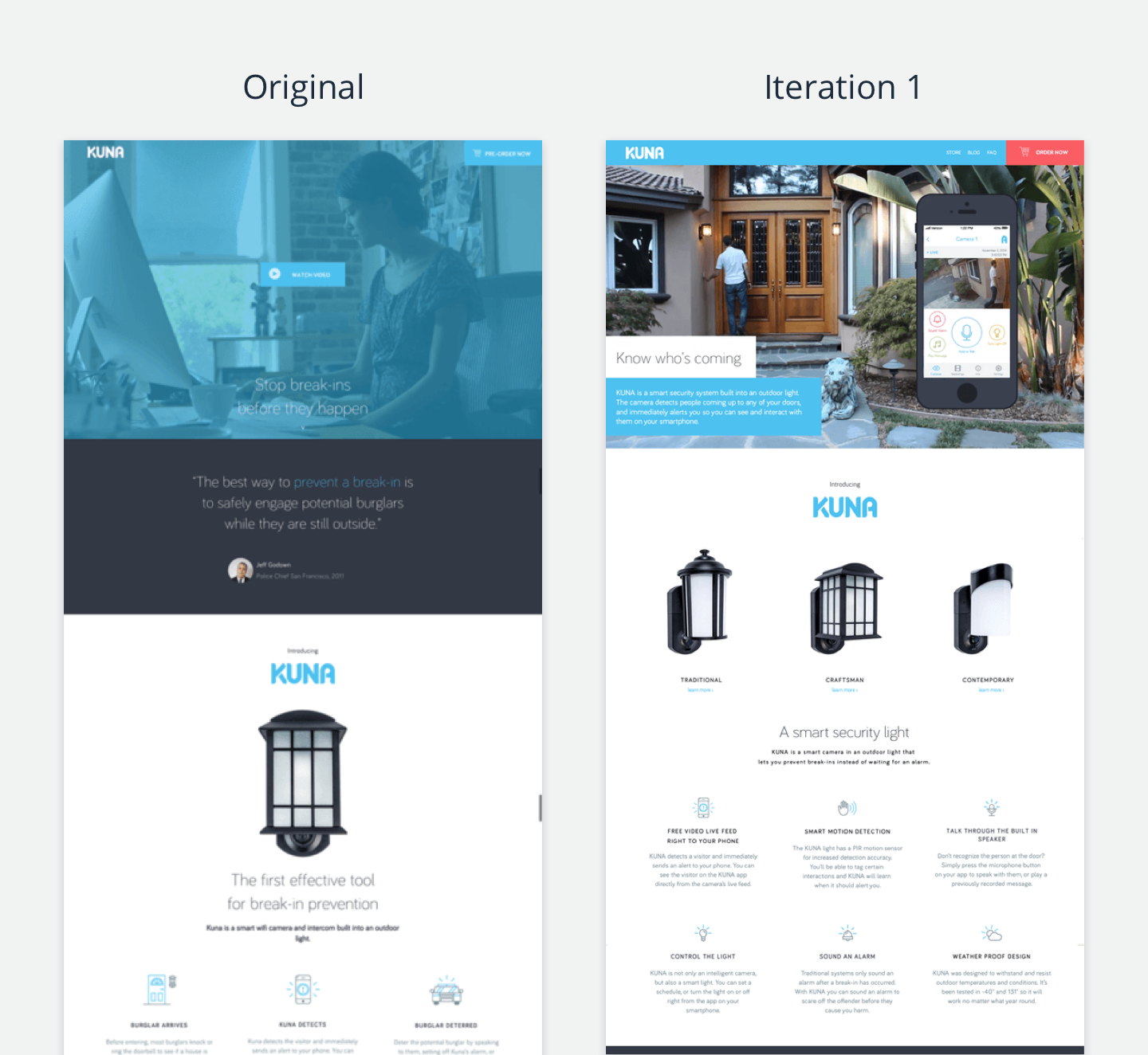
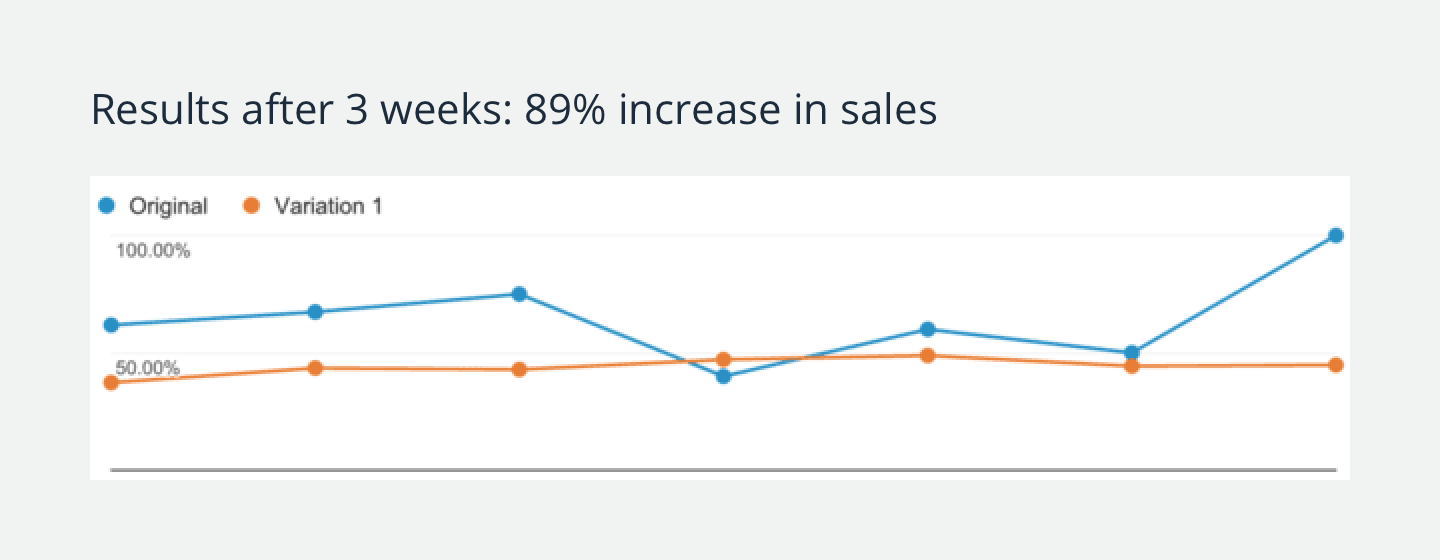
By the end of the three weeks the experiment ran, bounce rate had improved by 31%, conversion rates increased by 66%, and sales increased by 89%.
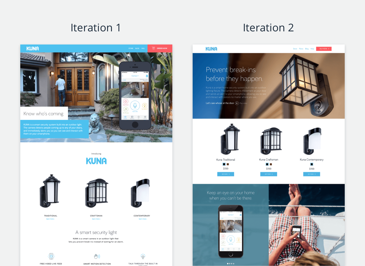
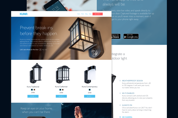
After four months, the newly designed homepage and simplified shopping experience helped increase Kuna’s monthly revenue by 265%.
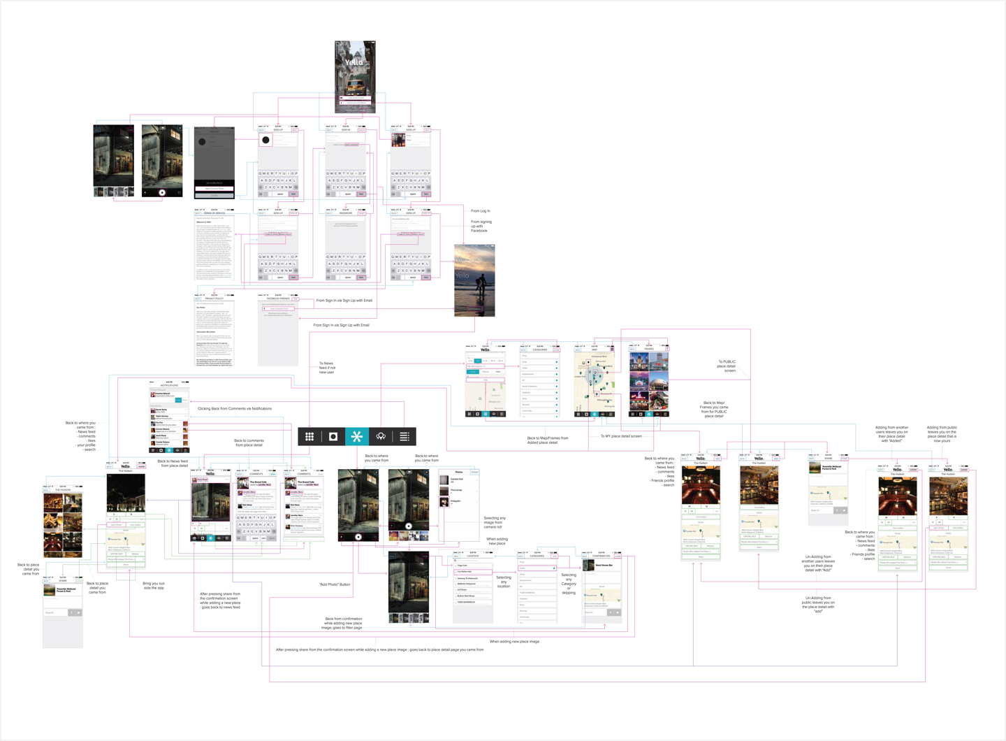
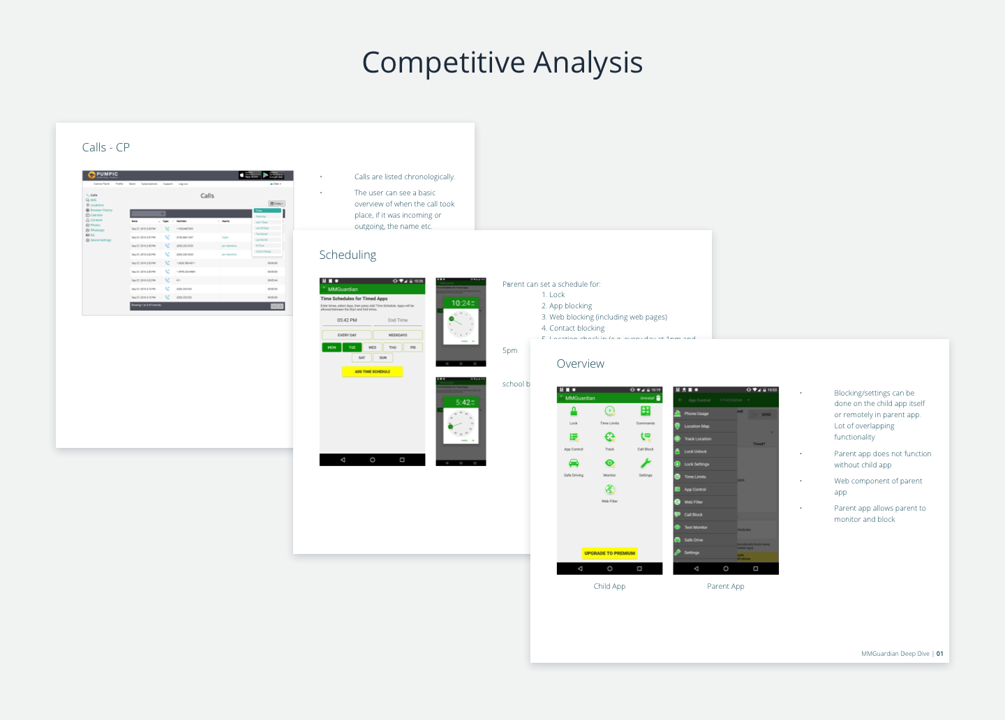
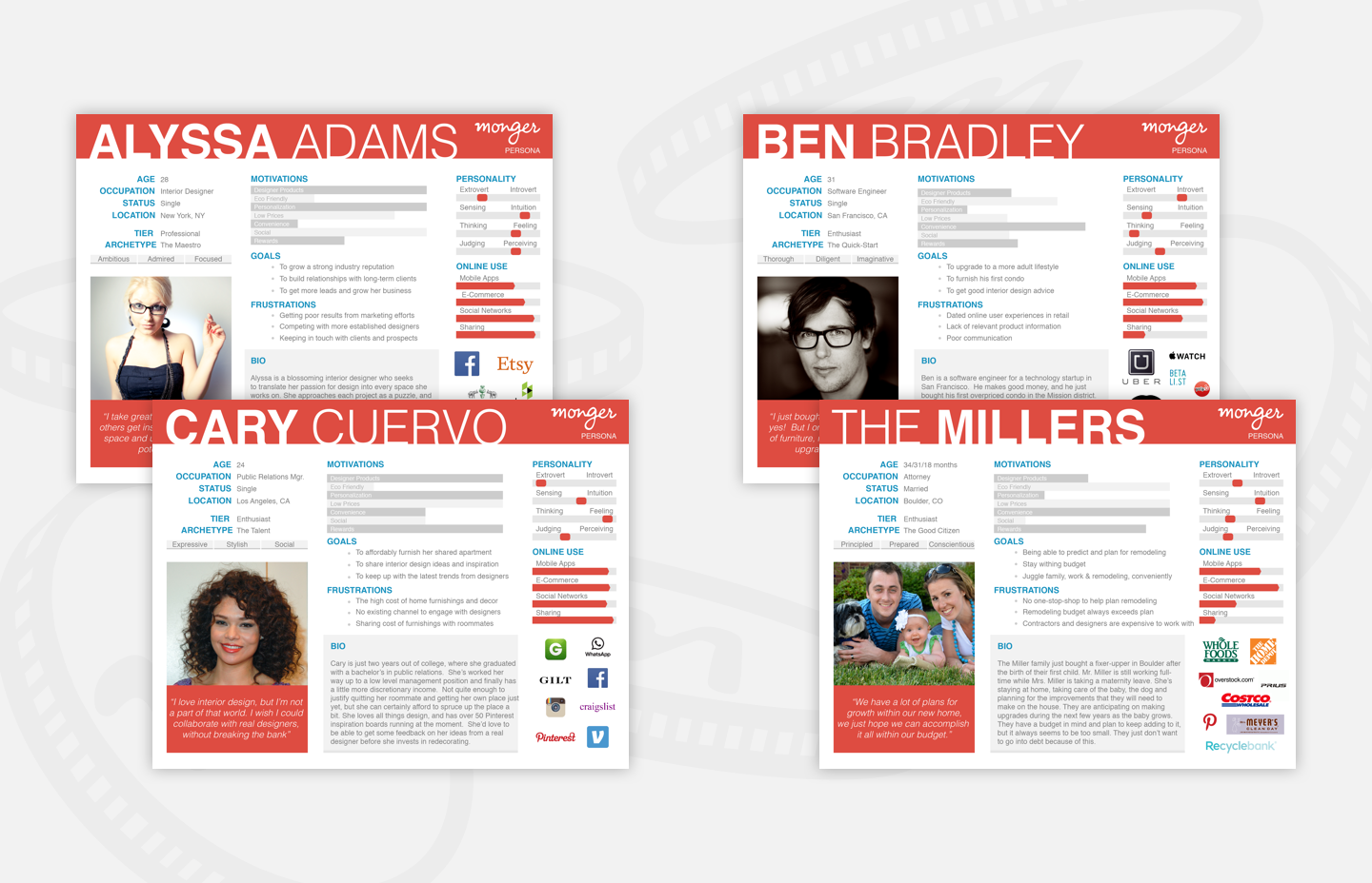
Persona Gathering & Information Architecture
App Design, Information Architecture & More